
Palapa
Making AI accessible to everyone
01 OVERVIEW
Context
Palapa is a startup dedicated to making AI accessible to all through its no-code platform. The app enables users—from tech enthusiasts and small business owners to educators and hobbyists—to effortlessly create and deploy their own AI assistants using an intuitive mobile app, requiring no programming skills.
The initial version of the Palapa app, developed by a programmer with limited design experience, faced several user experience challenges. This is where I stepped in to help redesign the app, aiming to create a more intuitive and user-friendly experience for its user base.
02 RESEARCH
Requirements
Next, I conducted a competitive analysis to understand the industry landscape. This research revealed opportunities for Palapa to enhance navigation, simplify AI creation, and improve status indicators.

With Palapa being a new player in the market, building a user base was a challenge. To address this, I created user personas, starting with John Carter, a pharmacist, representing our target users of the “Pill Counter” feature. This persona helped focus our design on the needs and challenges of professionals using Palapa daily.

User Needs
Every great design begins with a deep understanding of its purpose. My journey with Palapa started with collaborating with its stakeholders to grasp its vision and goals. We mapped out current problems and outlined business objectives using Milanote, setting the stage for a transformative redesign.

I then conducted semi-structured interviews with 5 potential users, primarily friends unfamiliar with the app. Their feedback on navigation and pain points guided our UX redesign, ensuring it met real user needs.


Analyzing the Current System…

To better understand the system, I analyzed the user flow and app structure, identifying areas for improvement. This analysis guided the creation of a simplified sitemap, improving navigation and enhancing the overall user experience.


03 DEFINE
Setting Clear Goals
After analyzing the app and gathering key insights, I defined the core requirements for the Palapa redesign. The stakeholders wanted a user-friendly platform where anyone, regardless of technical expertise, could easily create and manage AI assistants. This vision resonated with users, eager for a more functional and intuitive app that met their needs.


04 DESIGN
Early Ideations
The design journey began with brainstorming and sketching sessions to bring the app’s layout and functionalities to life. We explored various concepts and visualized the app’s potential through initial sketches, setting the foundation for the redesign.

Translating Ideas into Lo-fi Wireframes…
The app has a single-page layout, limiting user access to features and content. Adding a Navigation Bar will help users access different app features and sections easily.
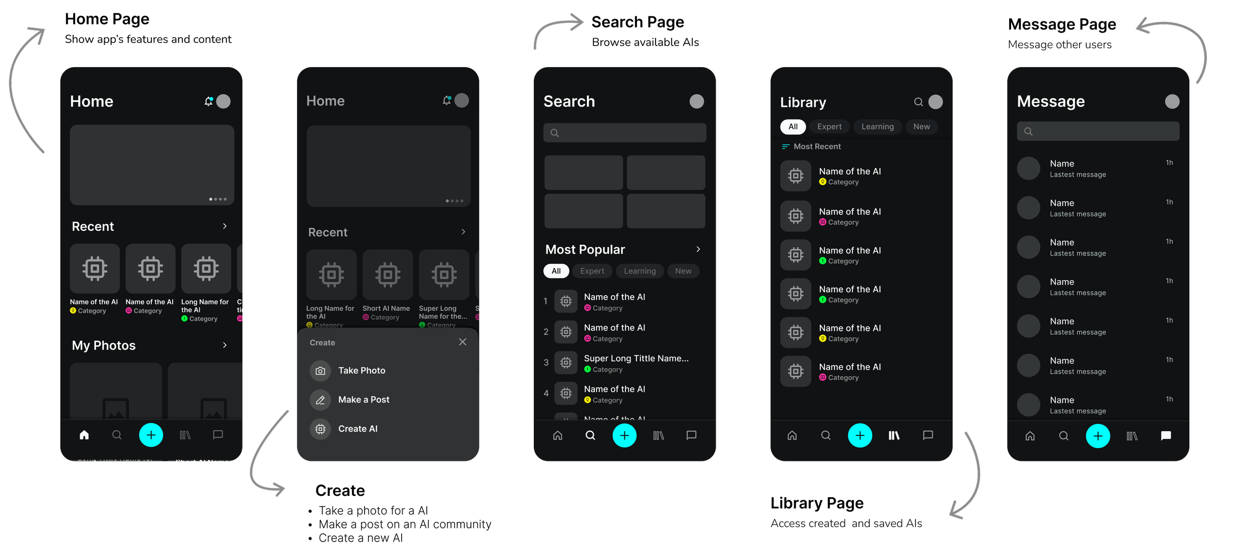
AI navigation was removed to prioritize the main app navigation, making the core features more accessible. Also, a social feature was introduced, enabling users to join and use other AIs while fostering community connections.

05 TESTING
Addressing User Feedback & Stakeholder Input


Testing and Validating
Following the design updates, I conducted usability tests with 7 participants unfamiliar with the app to gather feedback and validate the changes. The participants were asked to perform key tasks like creating and using AI assistants, which helped identify usability issues and confirmed the effectiveness of the new design elements. Their insights allowed us to fine-tune the interface, ensuring it was intuitive and easy to navigate for new users.

06 FINAL DESIGNS
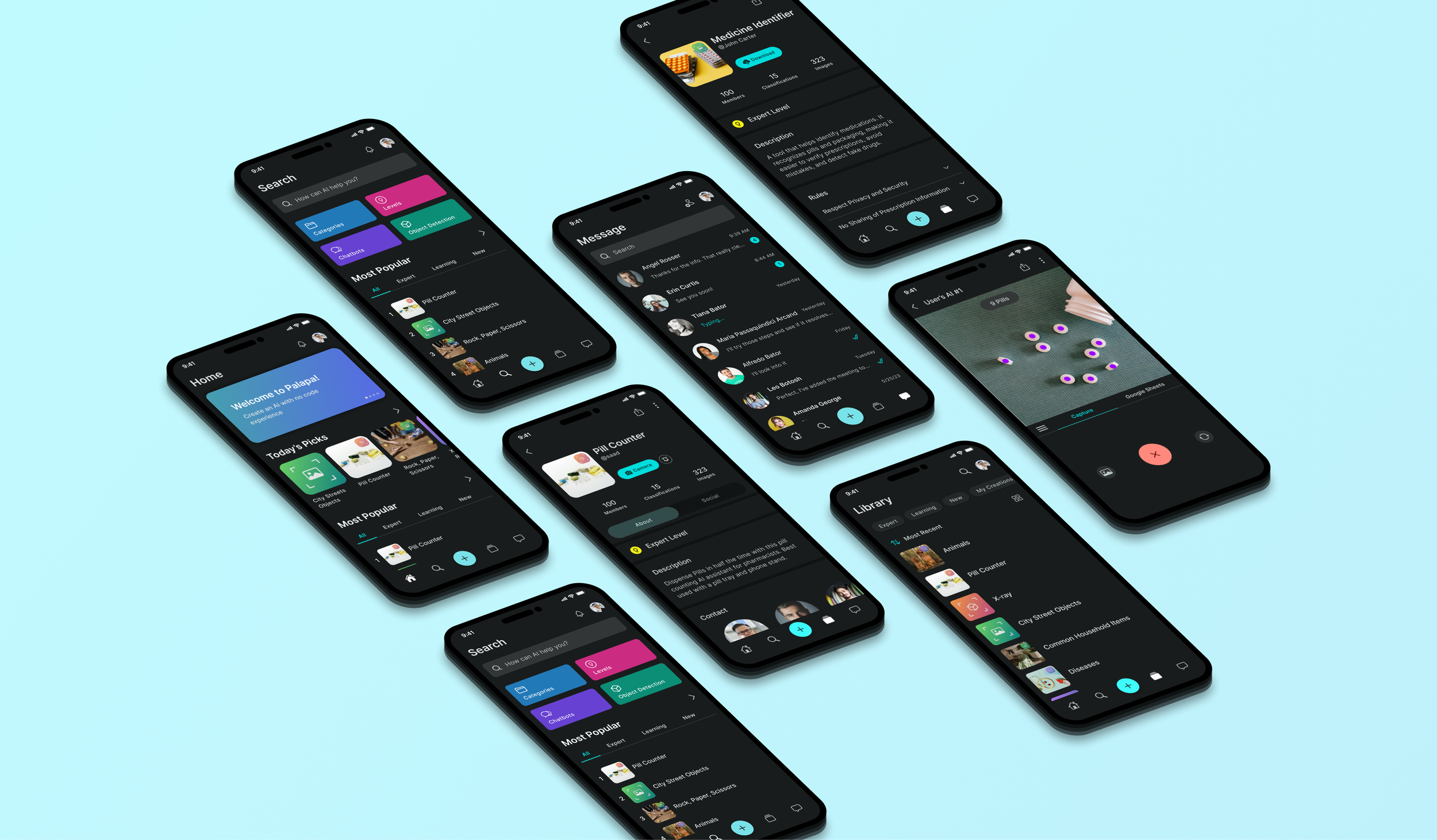
Navigation

Before

After
AI Profile
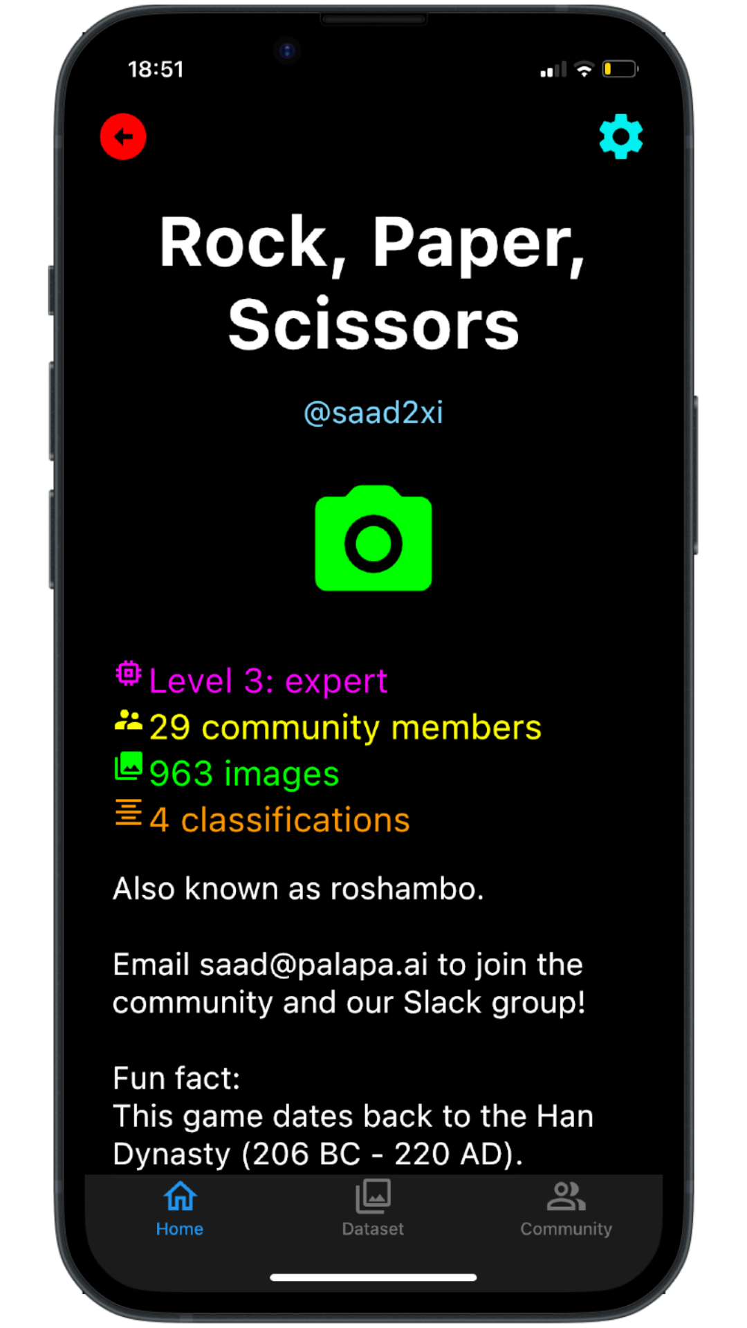
Before

After
Create AI
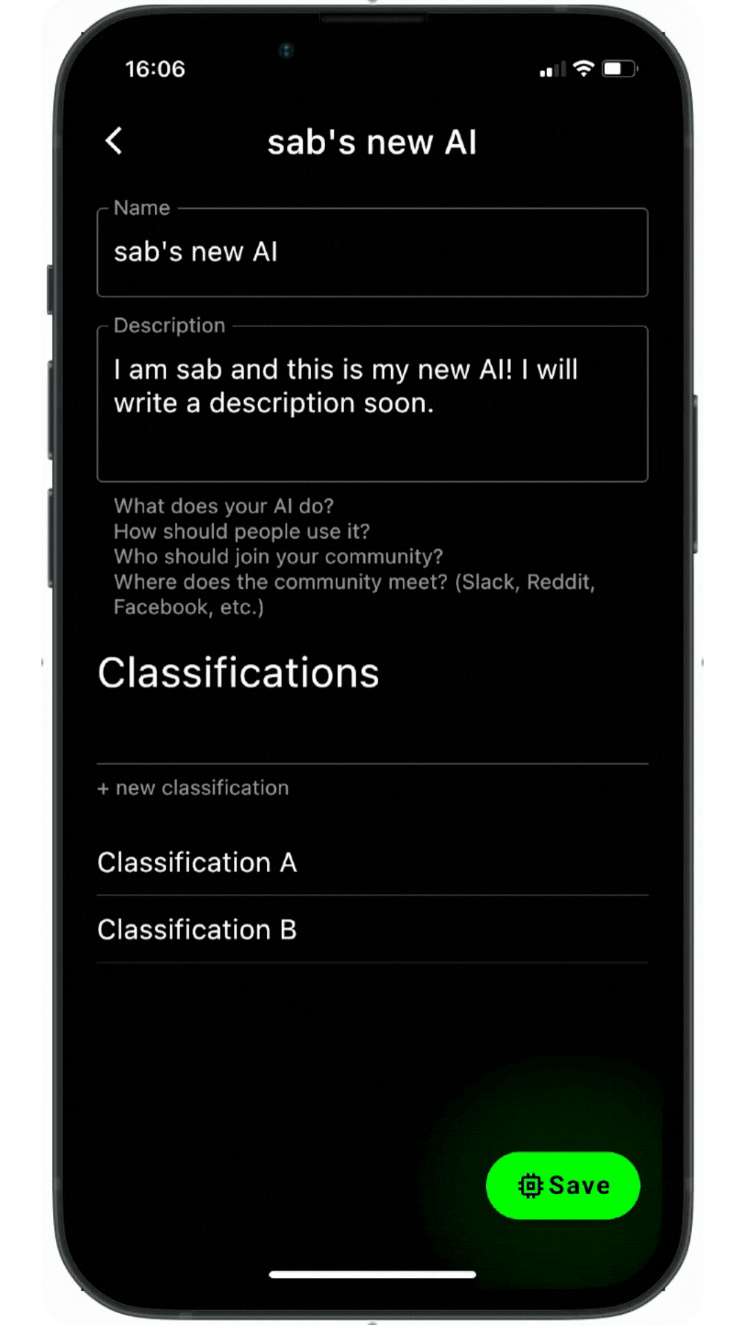
Before
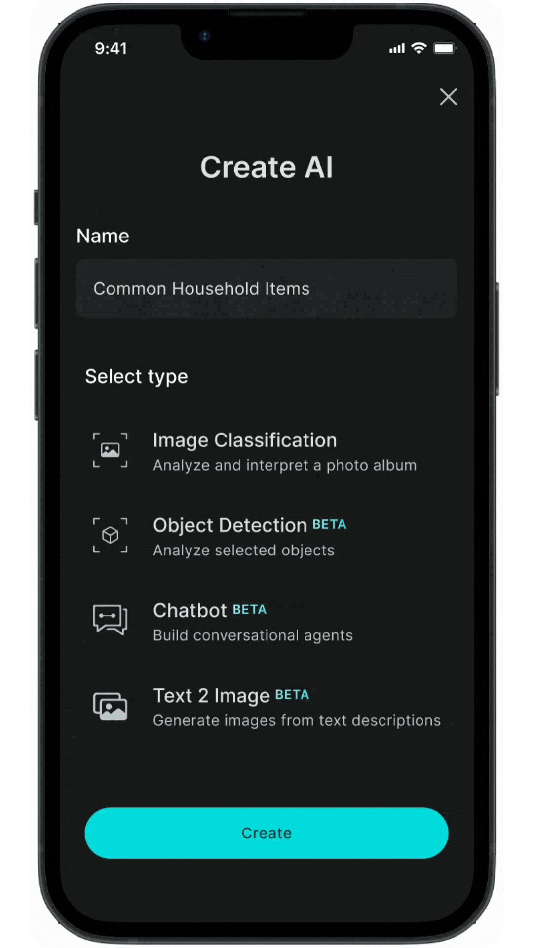
After
07 TAKEAWAYS
Measuring Success
Although the redesigned Palapa app is still currently in development, several methods have been implemented to predict and ensure its success:
Prototype Testing: Usability tests with low and high-fidelity prototypes involved 10 participants, achieving a 75% task completion rate with an average time of 2 minutes per task. Initial feedback indicated an 85% user satisfaction rate.
User Feedback: Qualitative feedback from interviews with 15 potential users showed that 80% found the new design more intuitive, and 90% had clear expectations for the final product.
Success Metrics Definition: Defined success metrics include targeting a 90% user satisfaction rate, aiming for a 50% increase in user engagement, and expecting a 30% higher task completion rate post-launch.
What I learned
Working at a startup was a challenging yet rewarding experience, requiring me to wear many hats and quickly adapt to various aspects of the industry. I faced steep learning curves, which provided invaluable insights into design systems and mastery of tools like Figma. This role also refined my communication skills with users and stakeholders to ensure project alignment. Balancing aesthetic appeal with functional efficacy, I prioritized usability and empathy, striving to deliver impactful user experiences while navigating the complexities of a startup environment.
What is next?
-
Continuously refine the app interface to improve usability and attract a wider user base. Through ongoing user testing and feedback, optimize features to meet the needs of the growing community.
-
Prioritize the development and design of planned features for Palapa's app. Conduct thorough research and user testing to ensure these new features meet user needs and enhance the app's capabilities.
-
Update Palapa's current website to align with the new design system and ensure consistent branding.
-
Design and launch a web version of Palapa to broaden accessibility and usability. Tailor features and interface based on user research to optimize engagement and functionality