Hachi AI
Making AI Search and Chat Fun
01 OVERVIEW
Context
In October, I joined a team of five UX designers to refine Hachi’s chat experience, enhancing its UX/UI and overall concept. What began as an AI persona platform evolved into a discovery engine, making search feel more fun and dynamic.
I led the development of the design system, ensuring consistency and scalability. Working closely with designers, managers, and stakeholders, I shaped the final interface and stayed hands-on from research to final design to align with user needs and Hachi’s vision.
Problem
Search is Exausthing
Finding quick answers online often feels exhausting and overwelming. Endless pages of generic results and long paragraphs make it hard to get the information you actually need.
The AI Limitation: Fast but Boring
Many turn to AI for faster responses, expecting a better experience. But most AI-generated answers feel bland and impersonal, lacking creativity or personality.
Solution
That’s where Hachi comes in!
Hachi reimagines search by offering fun, engaging, and personalized responses through AI characters with distinct personalities. Instead of just providing information, Hachi makes search feel like a dynamic, playful conversation that keeps users engaged.
02 RESEARCH
Stakeholders’ Request
SECONDARY RESEARCH
Competitive Analysis
We reviewed 10+ competitors in the AI-driven search engine space to ensure Hachi met user needs.
What opportunities did we identify?
MORE THAN JUST A CHAT BOT
Features like saving and sharing conversations, commonly used by competitors to boost engagement, could also encourage interaction and retention for Hachi.
BOOSTING ENGAGEMENT
Unlike competitors with generic one-to-one AI chats, Hachi lets users interact with diverse characters, each offering unique responses and suggestions.
PRIMARY RESEARCH
Surveys + User Interviews
We gathered insights from 50+ respondents through surveys and conducted 15+ in-depth user interviews.
What do users value?
CONVERSATIONS WITH PERSONALITY
Users enjoy characters with unique traits or shared interests, making search feel more like chatting with a friend.
PERSONALIZED EXPERIENCES
Users appreciate opportunities to tailor search outputs and value recommendations that evolve to better suit their needs.
Who is Hachi for?
03 DEFINE
Hachi’s Goal
When we first started working on Hachi, the product’s vision was still somewhat unclear.
Initially, we envisioned Hachi as an AI designed for emotional support—a friendly companion users could talk to. However, after discussions with stakeholders, the focus shifted. Hachi needed to become a more effective AI tool that provided personalized, non-generic answers rather than just basic recommendations. This pivot helped clarify Hachi's true identity, guiding our design decisions.
“Hachis have their own unique preferences. Instead of simply listing the top 10 restaurants in the area like most AIs, they’ll share their personal favorites and explain why they recommend them.”
Which led us to asking…
How might we design Hachi to enable flexible conversations and personalized recommendations, making search enjoyable and encouraging users to share their experiences?
Previous Experience
The UX flow felt restrictive
Our UX audit revealed that the rigid questionnaire format and repetitive loops made interactions feel structured and impersonal. Users had to go through multiple steps before receiving meaningful responses, making the experience feel more like filling out a form than having a conversation.
Updated Experience
A more natural, dynamic interaction
We redesigned Hachi’s experience by replacing the restrictive questionnaire with an open-ended Q&A loop. This allowed users to refine their queries dynamically, making interactions feel more fluid, engaging, and conversational.
04 IDEATION
Early Ideations
After much brainstorming, we started with a chat-like design, aiming for an experience that felt like chatting with a friend, natural, intuitive, and engaging.
Blending Chat and Visuals
Wanting a bolder, more playful approach, we explored a visual novel-inspired UI to make Hachi feel more fun and visually distinct. This added storytelling and interactive elements, making search more immersive while keeping conversations fluid and engaging.
Design System
Before jumping into high-fidelity prototyping, we focused on creating a solid design system. This system provided a foundation for the UI components, typography, colors, and other elements, ensuring consistency throughout the project.
As the design system led, I worked closely with the team to align all the elements, ensuring the product's visual aspects supported its core identity.
05 FINAL DESIGNS
Dynamic Conversations
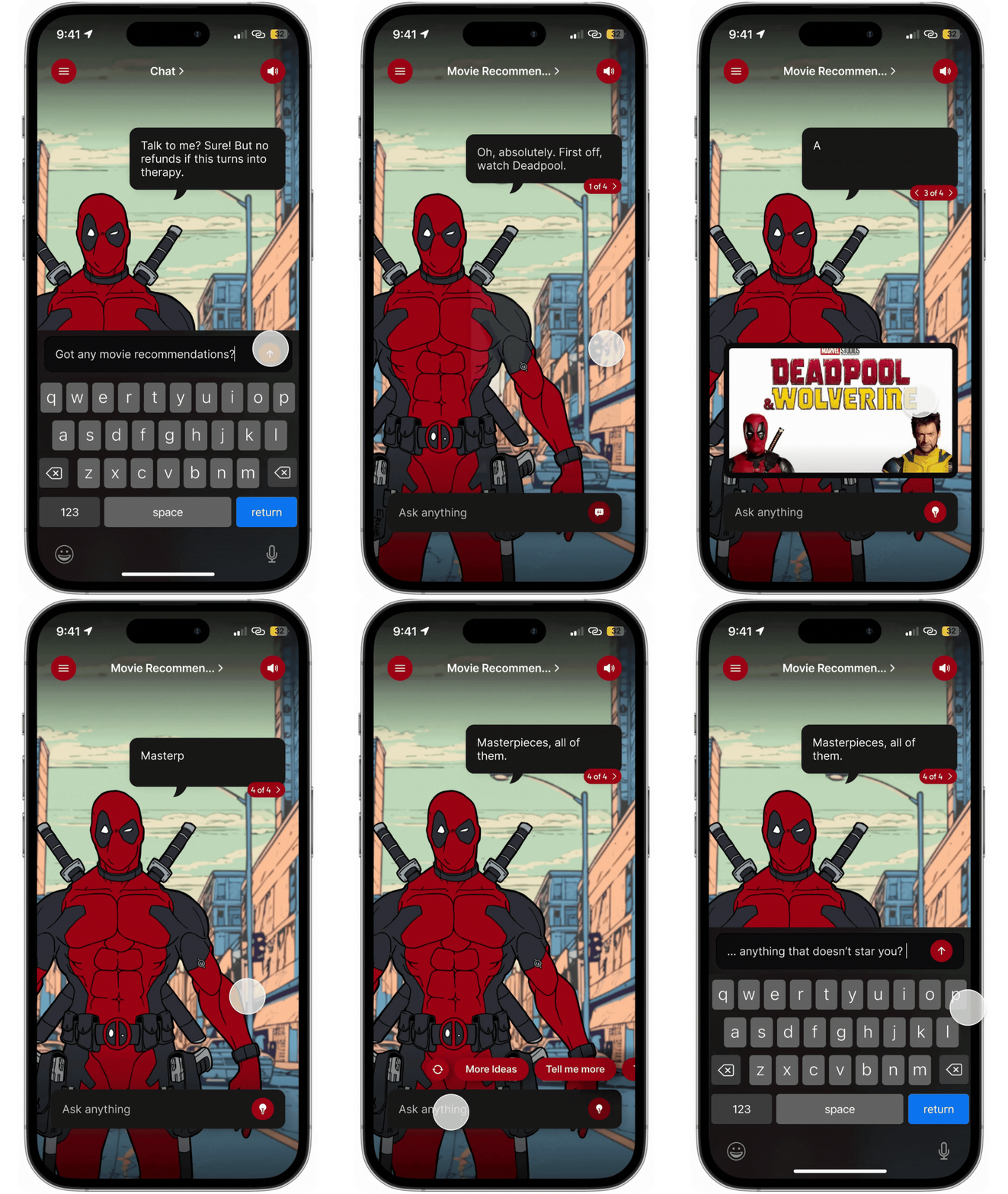
Text input for open-ended answers and answer prompts to guide users, making conversations feel more natural, flexible, and engaging.
Sharing Conversations
Users can share Hachi’s fun responses, encouraging more engagement and interaction.
Group Chat
Users can add multiple Hachis to a conversation, quickly swap between answers, and explore different perspectives.
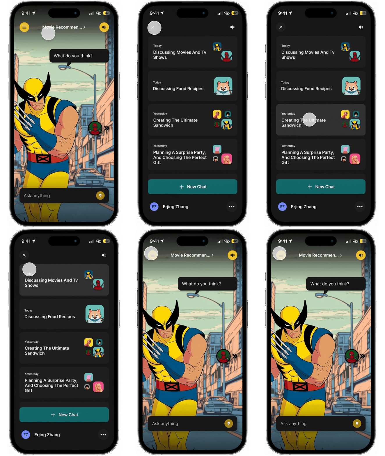
Chat History
Users can track past conversations and easily pick up discussions with different Hachis.
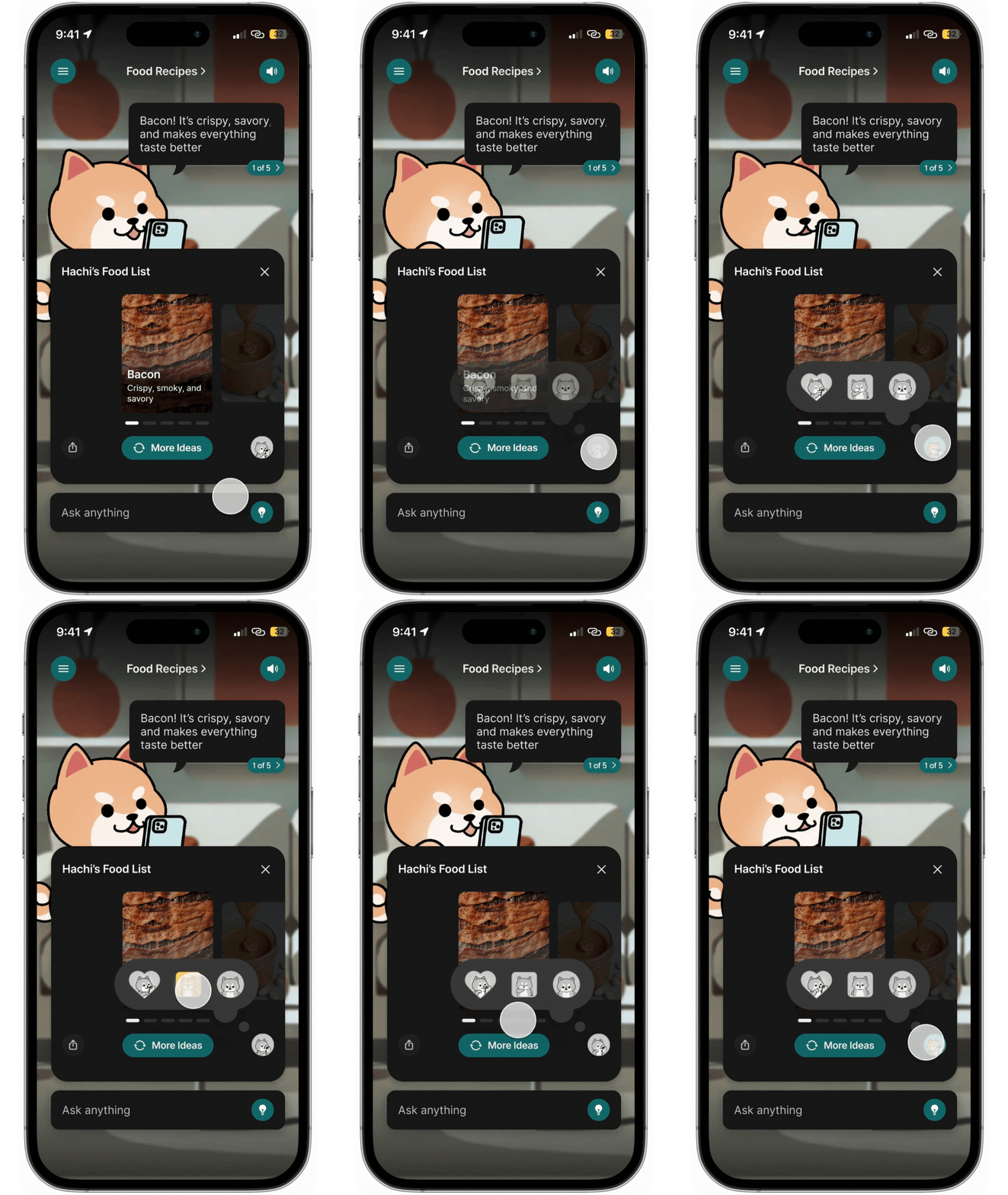
Hachi Reactions
Makes Hachi more personal and playful, while giving users a quick, fun way to provide feedback during conversations.
06 TAKEAWAYS
What was the Impact of Our Redesign?
📈 Increased Engagement
“The number of conversations initiated by users has gone up by 2x with the group chat feature.”
🎉 A More Fun & Dynamic Experience
“It’s so much more fun with multiple Hachis. Definitely better than the last version.”
💡 More Intuitive & Engaging UX
“Users preferred the new UX flow. It provided instant value compared to the old questionnaire style.”
“It used to feel like I had to answer a lot of questions... the new experience helps me understand the purpose of Hachi right away!”
What did I learn?
This experience taught me how to design AI that feels personal, responsive, and fun. I learned how to craft intuitive conversations, making interactions more natural and engaging.
I also improved at building personality-driven AI, ensuring each character had a unique voice that added meaning to the experience. I figured out how to blend fun and functionality, creating an experience that was not only engaging but also genuinely useful.
In addition to design, I collaborated with a fantastic team across various time zones. This presented challenges, but it helped me learn to work efficiently together, remain adaptable, and communicate effectively, even without everyone being online at the same time.


